035 Fixing Information Design In First Person Games
by Foster Douglas on February 4, 2015
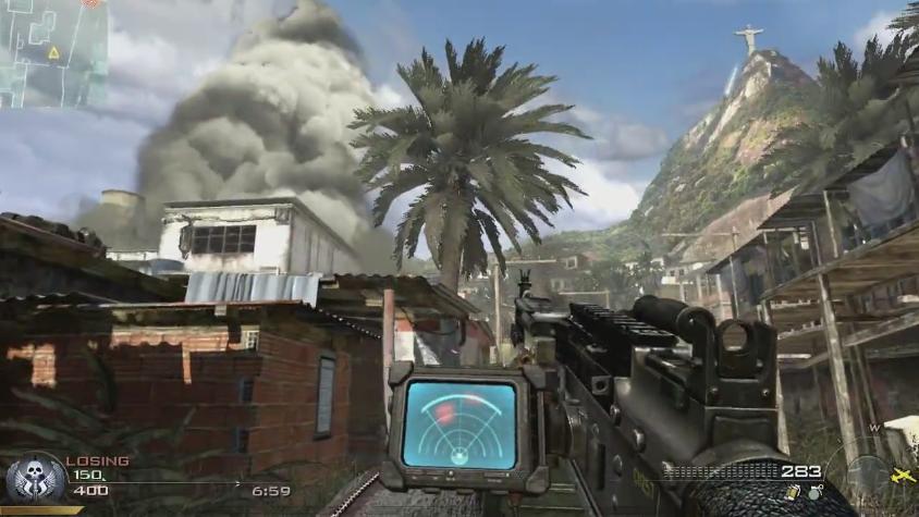
It’s interesting to me that the on-screen information design of modern first-person games has remained fairly consistent for so long; multiplayer/story information in the bottom left, weapon and ammo information in the bottom right, and map in the top left.

The problem with this set up is that all the important information is the furthest from the places on the screen that the player should be focusing on the most often. The center of the screen is the common denominator for the player’s eyes. It’s a resting point, a place of solace, and a comfort zone for the eyes. So, why don’t we put more information in the center of the screen?
I’m proposing that we redesign the flow of information on the screen in games that rely so heavily on so many various types of information.
#first-person-game, #interface-game-design