185 Underground Shopping UI
by Foster Douglas on July 4, 2015
I’ve recently started working on the visual layout and design for a shopping menu for my iPad game, Underground. See below for a .GIF of the current progress and images from different states in the design:

(1) A .GIF of roughly 5 hours of revisions spread out across a few weekends.
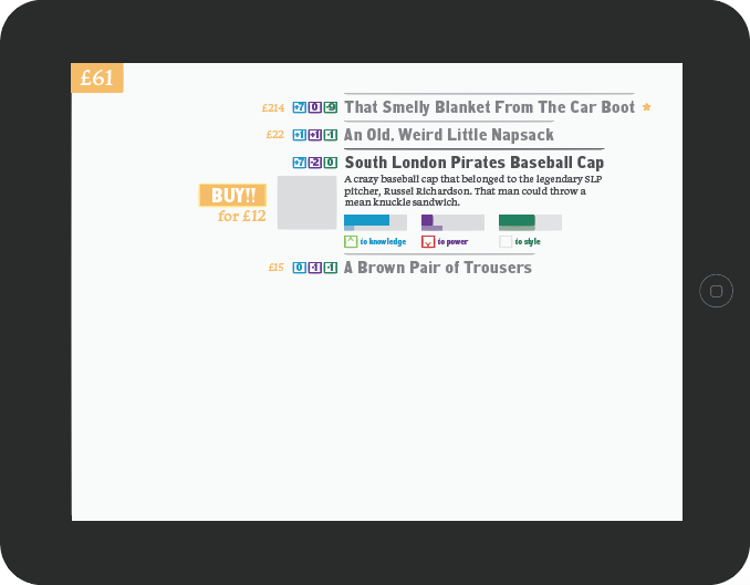
(2) It can be difficult to decide which information is most important to the player, especially at an early stage of design.

(3) The game has two main characters; showing the specifics of each character simply and elegantly is challenging.
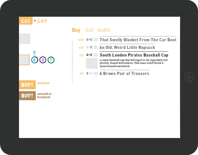
(4) Many games make you leave the shopping screen to access your personal inventory and equip/use items; I want to design this as an all-inclusive experience that avoids that.
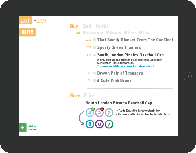
(5) Showing comparisons of the character’s values goes through many iterations (and needs more work yet).
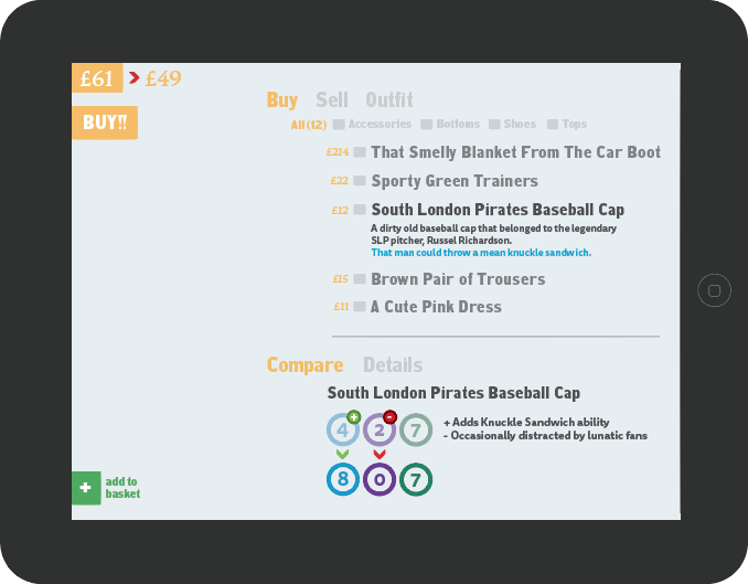
(6) Minor (but detailed!) tweaks.
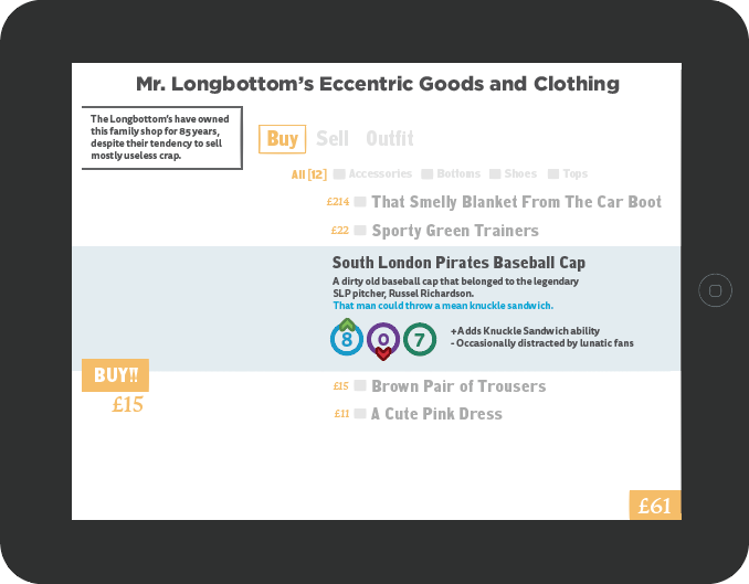
(7) Current iteration. Added a title of the shop and description text, and streamlined the entire experience a bit more.
[ Today I Was Playing: Planetside 2 and Borderlands: The Pre-Sequel! and Shadow of Mordor ]
#interface-game-design, #underground