684 The Importance Of Contextual Design
by Foster Douglas on November 15, 2016
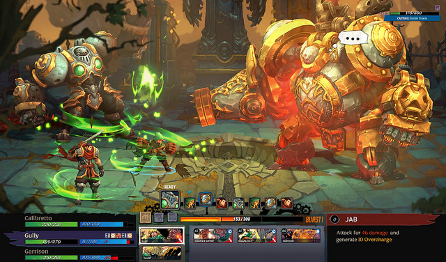
I saw this image on the Playstation blog recently, and it has me thinking about the importance of contextual design in gaming user interfaces (UI).

What I mean is, a lot of times UI in games is designed without focus on the player’s context. Like, how many video games has your player actually played before? Will they understand what your elements and colors and layouts mean? Is it required that they’ve played a specific genre of game before to fully utilize the interface?
That last question is key. It is of course impossible to create monumentally complex and interesting games without some complexity in the interface. And designers offload that complexity by relying on “tried and true” concepts, specifically because the player has seen these things before and will therefore understand them more easily. Or so the designer assumes the player has seen it before.
In the image above, there are lots of colors bars that have missing portions, and numbers overlaid on them. I’m not going to get too much into the history of it, but these were likely first seen widely around the SNES era, with RPG games like Chrono Trigger or fighting games like Street Fighter. It was also seen in limited capacities before this, even.
And what we’re talking about of course is the “health bar.” Or sometimes “magic” or “experience” or “resource.” It can represent many things, but it’s basically a bar graph of the amount of something you have out of the total amount you could have. It’s a popular thing to need in games that have avatars that need their “health” represented.
I think it’s cool that we have a shared and common language amongst gaming that allows for this to exist. But, I more firmly believe that these types of things should make sense without requiring the knowledge and context of 30+ years of video games. Looking at the above image as if I had no clue about video games, can I understand that the green probably means “health” while the blue probably means “magic?” Definitely not. There’s no reason one should mean either or.
In a series like Mario, it’s more direct. You see that when Mario picks up a mushroom, he grows. We understand as humans that growth means strength and wellness. When he touches something that hurts him, he shrinks again. We understand this mechanic almost immediately after experiencing it. In the image above, while the player may see that after X action happens, the green bar depletes, they also may not notice. It’s more obscured and abstracted, and requires more context.
So, because I’m not a professor with dozens of years of study in these things under my belt, I don’t think I have a direct answer to the problem. I just want to be more aware of it, especially in the future as I start designing more interfaces.
[ Today I Was Playing: Dishonored: Definitive Edition ]
#game-mechanic-system, #game-opinion