900 Revisiting Destiny's Revolutionary Menu Design
by Foster Douglas on June 19, 2017
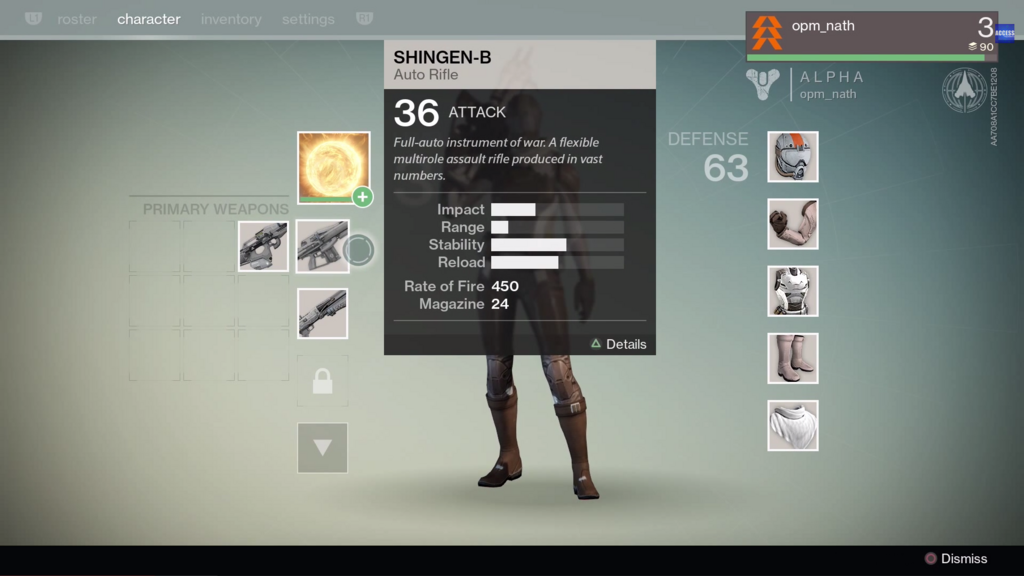
Even years later, after Bungie’s Destiny is slightly less relevant, and Destiny 2 is on the horizon, I find joy in some aspects of the game. In particular, I’ve always been fascinated by the design of the menu interaction on consoles.

I think the system does a superb job at creating an aesthetic and a very specific feeling. It is literally a tonal choice by the developers, which at the cost of functionality could be a dangerous decision, but ultimately ends up working. It’s a joy to use and cements you in the Destiny world very intentionally.
I’ve found out only recently that this type of interaction was received with almost unanimous hate from players. I found a post from someone named “Chronospherics” that outlines some of what I like about it, and adds a few other comments on the system. But what’s interesting is the responses to the post, which are 98% disagreement.
Many of the people comment on the “speed” of the cursor (which makes me feel like commenting on how impatient the gaming generation is), but I think there are always tradeoffs. If the dev team had chosen to use a highlighting system where you move around from box to box in the menu with the D-Pad, it may have felt quicker in that you are getting from one item to the next more quickly, but it may have not been more efficient overall. That is, the display of information moment to moment and where I want to be focusing might be more efficient using the cursor. It’s hard to know, and again they certainly could have designed it in a way to work more efficiently, at the cost of how it feels.
Yes, I’m fully aware of how pretentious that sounds.
[ Today I Was Playing: The Witcher: Enhanced Edition ]
#game-opinion, #interface-game-design